Okay, here’s the thing about templates: they’re awesome and they save a ton of time. But if you just use them straight out of the box? Yeah… they look like everyone else’s content. Totally generic.
I’ve been there. You pick a “cute” Instagram template or a LinkedIn post layout, slap in your text, and it just… blends in. Not what you want, right? So here’s how I usually handle it so it actually feels like my brand, not a random stock template.
Start With Your Brand, Not the Free Templates
Before you even open the file, think about your brand.
- Colors: Swap out anything that doesn’t match your palette.
- Fonts: Make sure it pairs with your usual fonts — even small tweaks make a big difference.
- Logo: Plopping it somewhere subtle instantly makes the template feel like it belongs to you.
Honestly, sometimes that’s all it takes to make a template feel custom.
Don’t Be Afraid to Move Things Around
Templates are usually designed for “generic use,” which means they don’t always fit your content.
- Move text boxes or image frames if they look awkward.
- Resize elements to highlight your main point.
- Delete or add sections if needed — don’t feel trapped by the template.
A few small changes can completely transform a design.
Add Your Own Visual Touches

Image by Pikwizard.com
Stock templates usually have placeholders. That’s fine, but if you leave them as-is, it screams “stock.”
- Swap in your own images, icons, or graphics.
- Add subtle overlays, textures, or borders to make it look unique.
- Even tiny details like a line, a shape, or a shadow can make a template feel fully yours.
Make Sure the Mood Matches Your Brand
Templates can be a little off sometimes — bright colors for a professional brand, moody tones for a fun brand.
- Bright and playful? Amp up the color and make it fun.
- Minimal and professional? Keep it clean and structured.
- Experimental? Go ahead and mix elements, but make it intentional.
Resize and Repurpose

Image by Pikwizard.com
Different platforms need different shapes.
- Instagram feed = square (1:1)
- Stories/Reels = vertical (9:16)
- Facebook or website = horizontal (16:9)
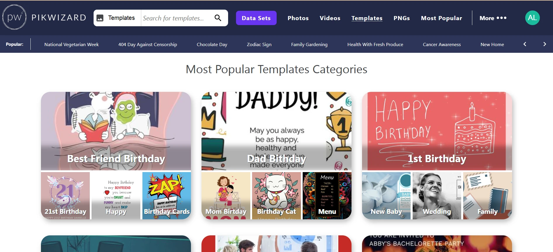
If you start with good-quality templates — I usually grab mine from Pikwizard.com — resizing is easy, and your graphics stay sharp.
Keep It Consistent
Once you find a style that works, stick with it.
- Use the same colors, fonts, and overlays across posts.
- Keep logos and spacing consistent.
- Your audience will start recognizing your content instantly.
Templates are supposed to save time, not make your content look generic. A few tweaks — colors, fonts, layout, visuals — and suddenly it’s all yours.
Start with a solid template from Pikwizard, spend a few minutes customizing, and boom — you have professional, on-brand content that actually feels unique.